A discreet telehealth e-commerce platform for LGBTQ+ HIV care. Designed the complete digital journey - landing page, medical intake forms, e-commerce checkout, and patient dashboard. Balanced vibrant representation with medical trustworthiness.

Aspects of this project have been changed, are confidential & can’t be displayed publicly. If you’d like to know more about my process, schedule a portfolio presentation.


Challenge
Build trust and convert cautious first-time users while maintaining LGBTQ+ representation throughout a complex medical intake process.

Users
LGBTQ+ individuals aged 24-35 seeking discreet, affirming healthcare with high privacy concerns.

Privacy Concerns
"Will my information be kept private?"

Trust Issues
"Does this look legitimate or like a scam?"

Representation
"Is this service really designed for people like me?"

Process Length
"How long will this intake process take?"
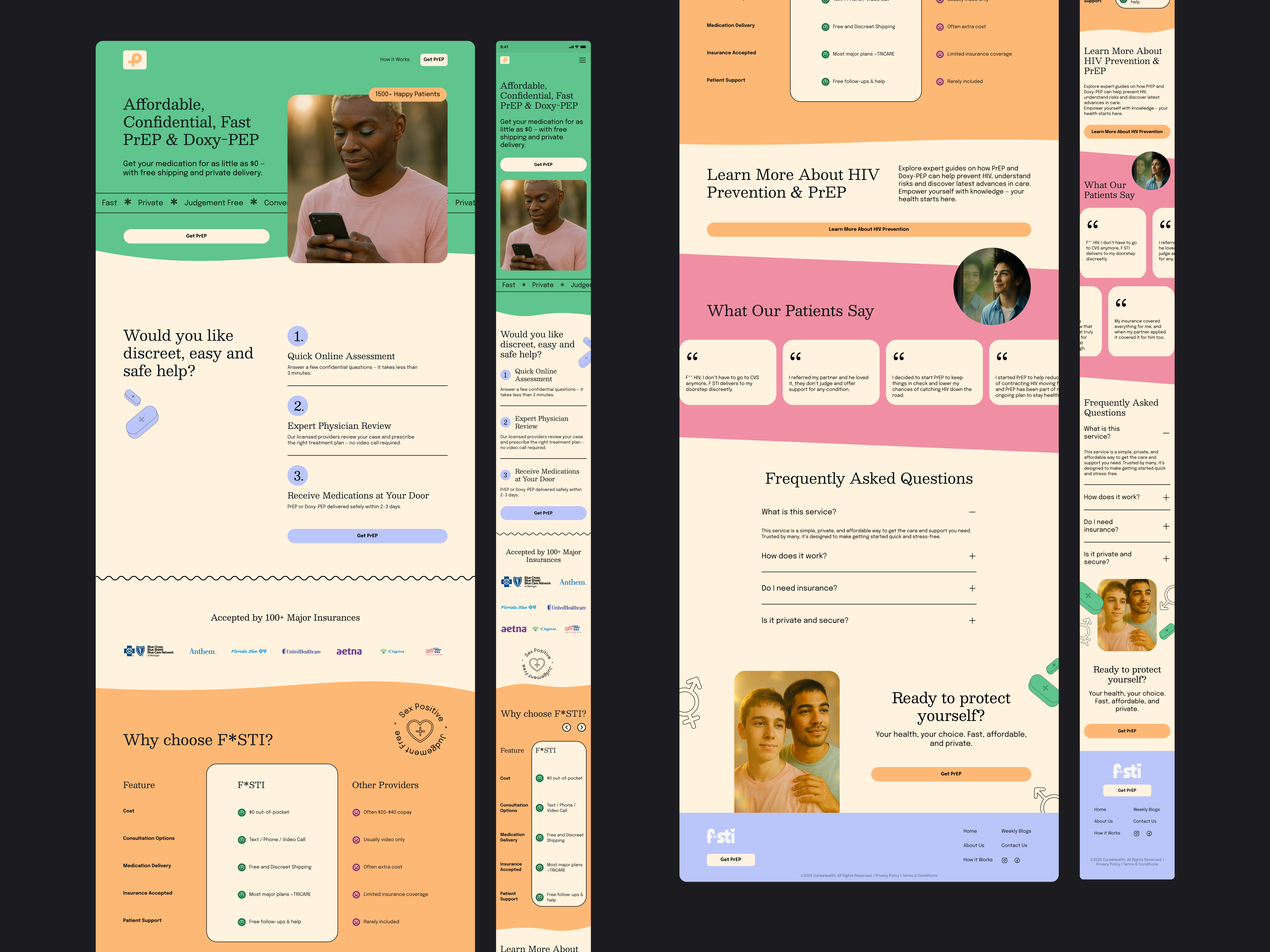
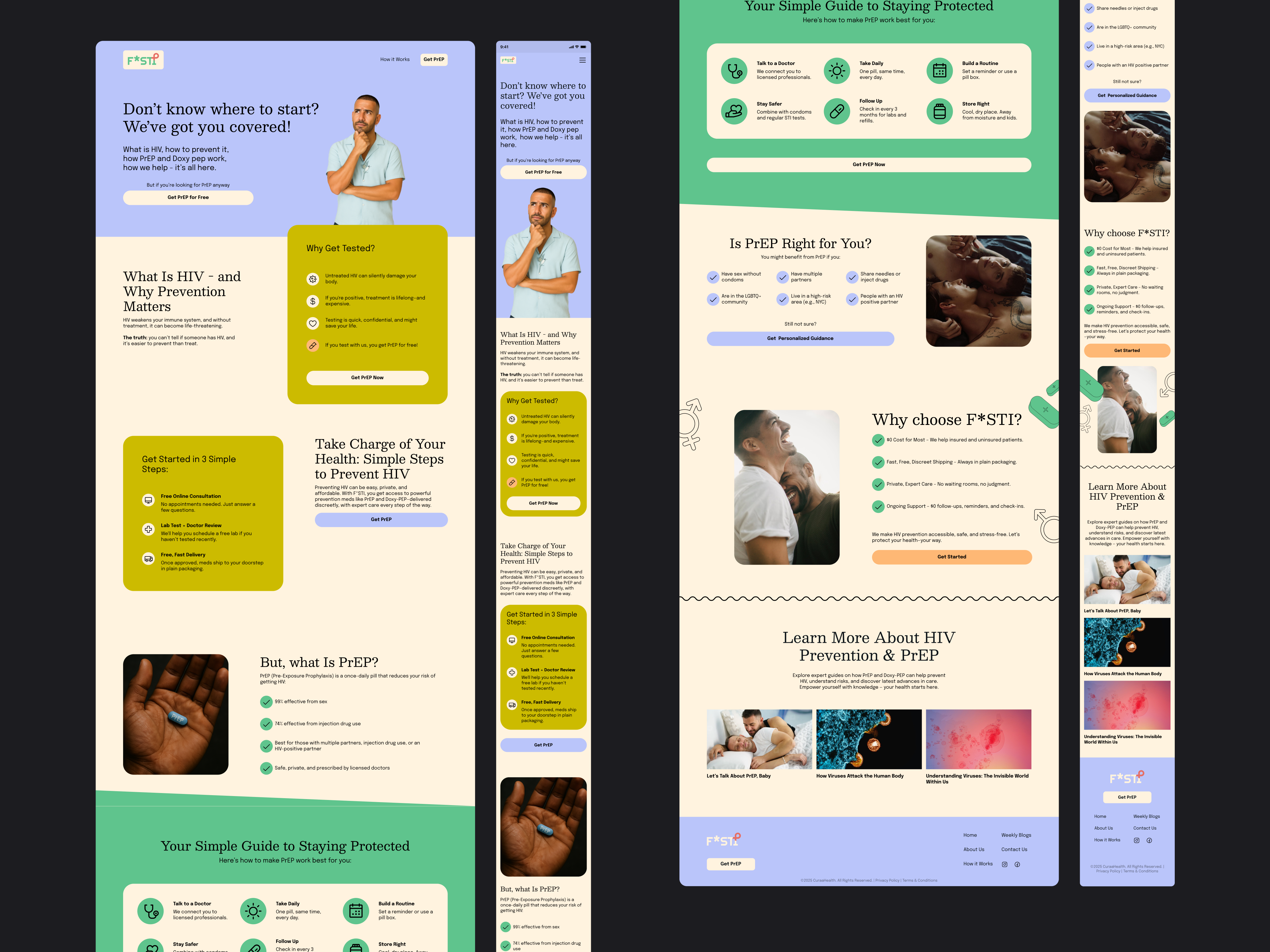
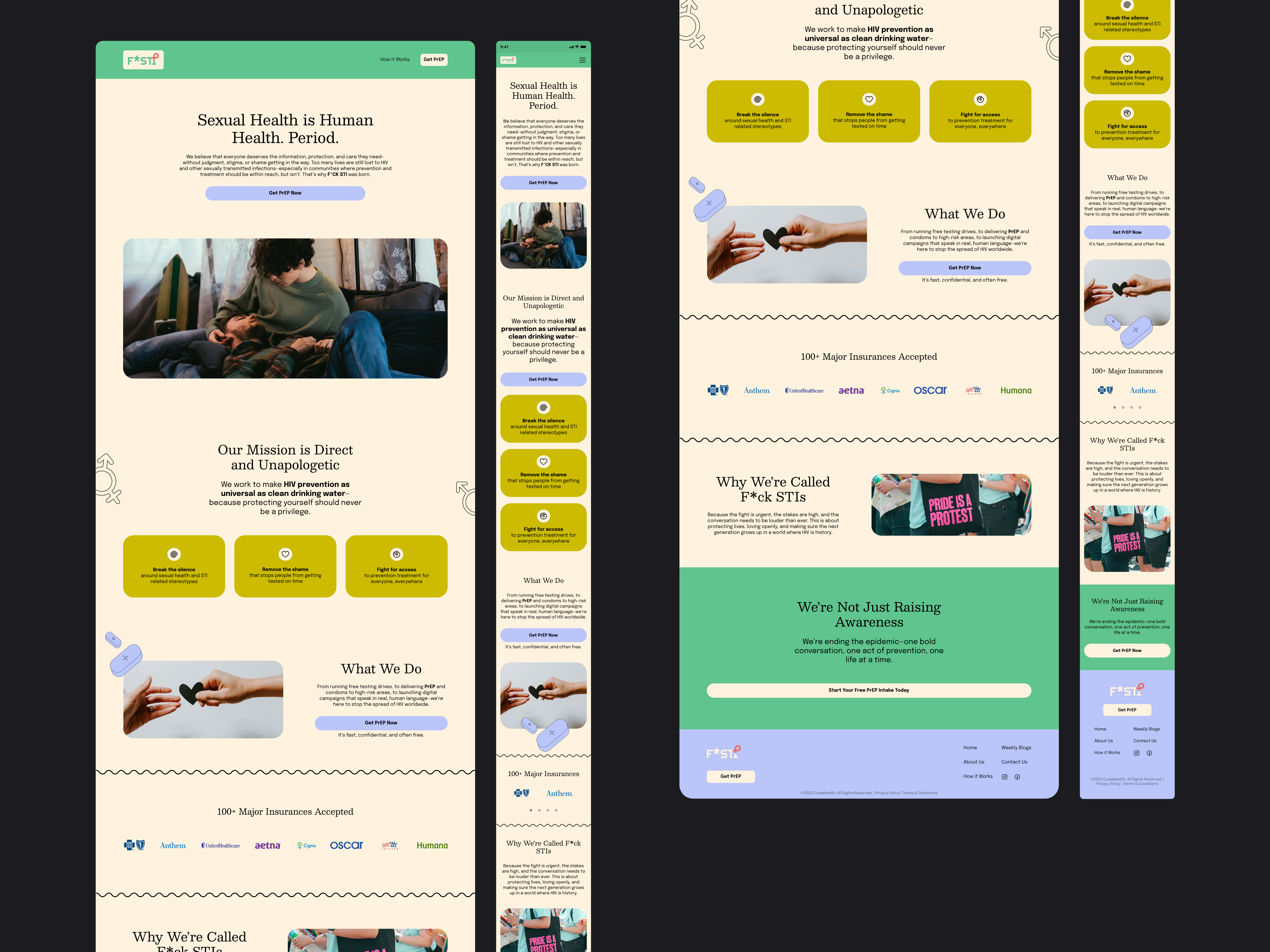
Users wanted someone who understood the sensitivity and importance of the topic, someone professional and trustworthy. They didn’t find our or competitors’ landing pages credible due to inconsistent style guides that made them look unpolished.
Created a vibrant, pride-inspired design system with pastel colors drawn from the LGBTQ+ community flag. Focused on consistent spacing, rounded shapes, and prominent trust signals to differentiate from competitors' inconsistent visual language. Our aim was to look more professional and trustworthy than them.
Competitor Weaknesses
Sharp edges mixed with smooth curves
Inconsistent spacing and imagery
Extreme type size contrast
No cohesive visual system
Our Approach
Consistent spacing and rounded shapes
Pastel vibrancy for accessibility
Trust badges above the fold
Systematic design language

Key Principle
Systematic visual consistency creates subconscious trust. Every spacing decision, color choice, and shape reinforces professionalism while maintaining vibrant community representation. This helped us stand out when our users sought competitors for comparison.
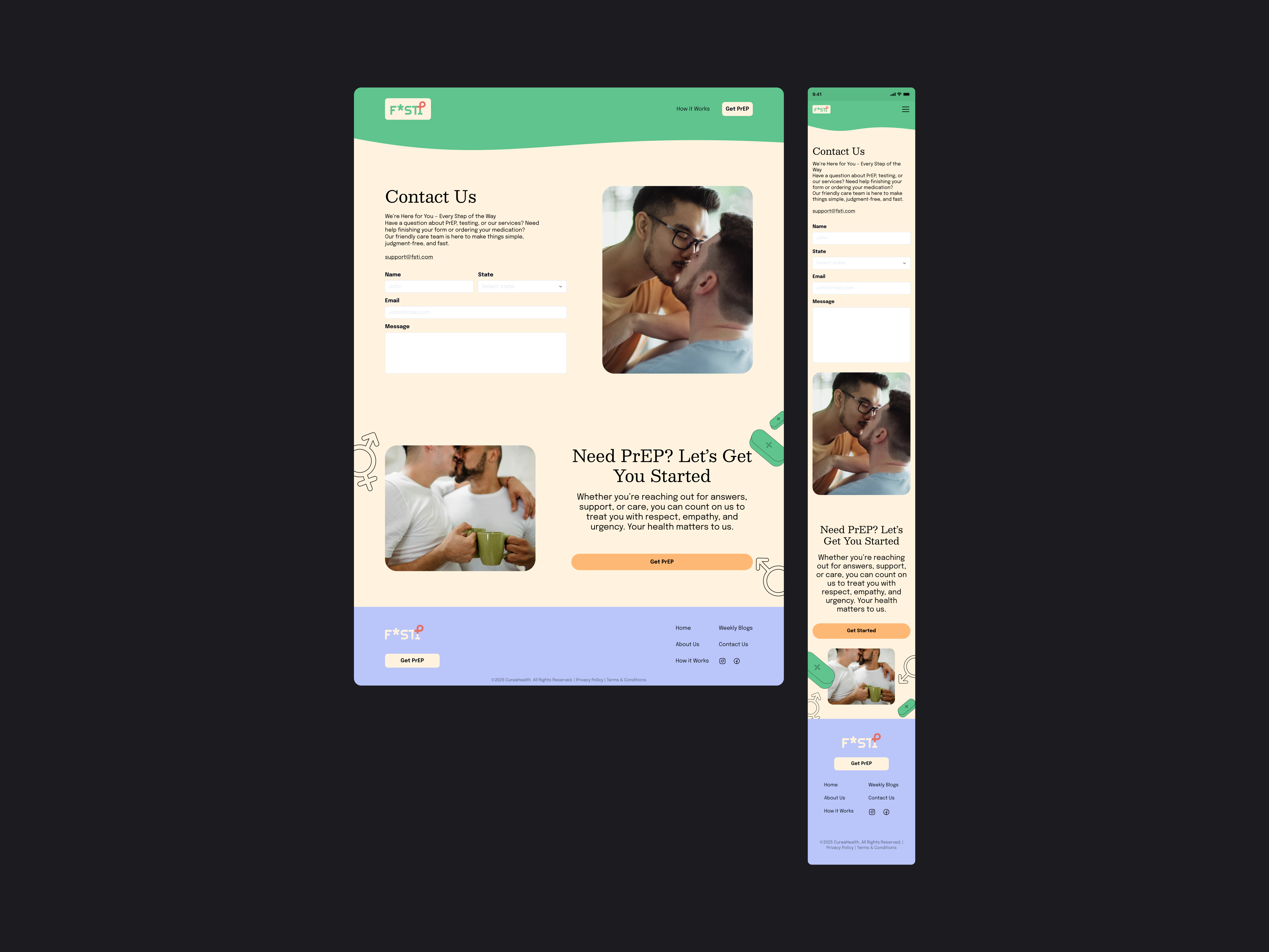
Transitioned to muted colors for a 10-minute HIPAA-compliant intake process requiring medical history and insurance information. This helped us look serious and trsutworthy while letting the user focus on the task at hand with minimal cognitive load. Integrated e-commerce seamlessly mid-flow for prescription and test kit orders.
Form Optimization
Multi-step design with progress indicators
Inline validation for immediate feedback
Minimal cognitive load
Professional, muted color palette
E-Commerce Principles
Trust badges at critical decision points
Transparent pricing (no surprise costs)
Insurance verification upfront
Minimal scrolling, simple UX

A/B Testing Results
Multi-step vs. Single-page
41% lower abandonment
Progress bar vs. None
23% higher completion
A few screens from the


A few screens from the


Created an omnichannel dashboard for prescription reorders, appointment booking, and progress tracking. Negotiated with client to use brand colors as strategic accents rather than backgrounds to maintain accessibility and professional credibility.
Dashboard Features
View prescription and test kit progress
Book appointments with medical providers
Reorder prescriptions with automated reminders
Contact clinical practitioners

Design Negotiation
Successfully advocated for accessibility over full vibrancy by presenting user research showing 73% concern about "unprofessional" bright medical forms. Solution: brand colors as accent colors, not backgruond colors, for brand recognition while maintaining professional credibility. Achieved WCAG AA compliance across all touchpoints.
A few screens from the


Landing Page Conversion
+34%
Increase vs. industry benchmark
(visitor → intake start)
Form Abandonment
-41%
Reduction through multi-step design and progress indicators
E-Commerce Conversion
+28%
Higher rate vs. initial single-page checkout
User Satisfaction
4.7/5
Dashboard usability score (n=312 respondents)
Accessibility
WCAG AA
Compliance achieved across all touchpoints
Retention Rate
62%
Returning users for prescription reorders (18% above target)
In the absence of reviews (which could drive users to competitors), we focused on trust badges, transparent pricing from the start, upfront insurance verification, and minimal scrolling. This resulted in a 28% higher conversion rate compared to the initial single-page checkout approach.
Close collaboration between marketing and design teams created a multiplier effect. Marketing insights about competitor weaknesses informed our design system, while design's focus on visual consistency strengthened marketing's conversion messaging. This symbiotic relationship proved that when both teams align on user trust as the primary goal, they can support each other's strategies seamlessly.
Vibrant representation and clinical credibility can coexist through context-adaptive design. The landing page celebrated LGBTQ+ identity with pride-inspired colors, while forms used muted tones for focus, and the dashboard balanced both through strategic accent colors. This approach proved that you don't need to strip away community identity to appear "medical."
When the client requested full vibrancy in the dashboard, presenting accessibility audits and user research (73% concern about "unprofessional" bright medical forms) enabled a win-win solution. This resulted in WCAG AA compliance while maintaining brand recognition through strategic accent colors.


